

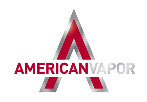
American Vapor was in need of a design overhaul as their branding had major readability and style issues. In record time I was able to completely redesign their entire lineup including logo, website, advertising and all packaging and in-store displays. The end result was quite striking and sales immediately increased. See the entire campaign here.
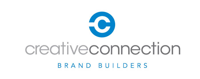
Creative Connection is a boutique advertising and design firm that specializes in green building products and builders. Utilizing the double c in their name I set out to create an icon that represents a building tool. Additionally, I offered up the tagline BRAND BUILDERS to emphasize their construction related client list and goal to help those clients build their brands in the market.
Chat Chow TV creator Giovanny Gutierrez came to me with his is a mouth-watering video podcast concept where they were going behind the scenes with the chefs, owners and mixologists of the food industry. We arrived to this graphic statement that also made a great video animation utilizing all the food icons still in use today on chatchow.com
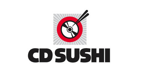
CD Sushi specialized in music sales online of tracks and recordings that were outside the mainstream with special emphasis on hard to find, original club and remixed house music. This design was created as a logo people would want to wear. Remember when people bought CD’s?
North Carolina’s Crystal Coast, better known as The Southern Outer Banks, was suffering from two issues. The first was having 2 different names depending on who you ask and the second was where exactly is this amazing place? This logo design solved both issues with a simple graphic of the state displaying an orange star on the location as well as communicating both names in use. The retro style and faded color conveys the laid back style of the area that specializes in friendly old-fashioned hospitality in an all natural, relaxed environment.
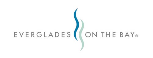
Everglades on the Bay came to Tinsley Advertising and the brand identity had several designers submitting their ideas. When this design utilizing two waves to create the EB capturing the locations aquatic name was submitted it was an instant approval by the client. It reminds the viewer of the original Everglades Hotel and its 60’s era deco roots.

While working with Heather Schueppert on Brights Creek we found the perfect alliance of organization and creativity. We started working as a team on additional projects including her own brand identity and website. She is a consultant that helps clients find the right message before they begin communicating through PR and advertising efforts. After several concepts we both agreed on this iconic use of one shape that evolves into a completely different letter only by reversing it. Find out more about Heather and her thriving business at evolutionstrategy.com
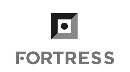
Fortress Safes created by Heritage Safe Company wanted something less historic looking for the new millennia of safe buyers. This simple direct concept conveys the shape of a strong safe, complete with the center dial, while capturing the letter F in one simple iconic graphic. This is my favorite logo of all the logos I have designed.
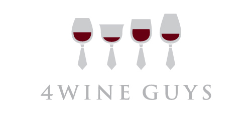
Four Wine Guys was quite literally four good friends that bought small batches of wine that couldn’t be sold to the large distributors. Capturing the camaraderie between them and the pure joy of enjoying the search for great wines together was captured in this simple graphic that is more than glasses of wine. It’s the fun and laughter that goes with every great bottle of wine when shared with friends.
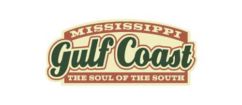
The Mississippi Gulf Coast had somewhat of an image problem. It seemed to be known as the place for blue collar folks to go and gamble. Striking back to the area’s great musical history, I designed this vintage style logo and wrote the perfect tagline “The Soul of the South”. Utilizing the state, area and tagline in one cohesive shape, it made it possible for all future advertising to be consistent and clear no matter how small the media while reminding travelers their is much more in the Gulf Coast than gambling.
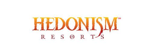
While working on SuperClubs Resorts we all felt the Hedonism Resort chain was in desperate need of a new logo as its current version was anything but wicked. Channeling the tagline “Be Wicked for a week” I created this design that is still in use by the clothing optional Jamaican resort chain today.

NailLite is a ultra-real looking, ultra-light siding product that is not only environmentally friendly compared to using real wood it was 50% lighter than the real thing and never needed painting or repairs. The savings in weight made installation much easier. The initial cost is higher than real wood, so the brand needed to convey prestige. The simple use of a N and L created a small structure and conveyed the very siding itself in a clean, upscale and unforgettable logo design.
This very high end interior design firm was looking for a way to stand out in the world of thin san serif logos used by every other design group advertising in the same publications. Taking a look at their profession it only made sense to convey the three dimensional challenge they face on every project. The use of negative space allowed this shape to be created using only one color making it practical as well as visually striking.
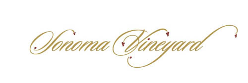
Working in collaboration with Ronin Advertising Group we arrived at several approaches for Sonoma Vineyards but this one was always one of my personal favorites. The addition of a few “grapes” to this elegant typeface was simple and timeless. It proves that a logo doesn’t need an icon and still be completely unique in the market.
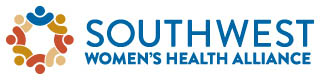
Evolution Strategy brought me the monumental task of rebranding an entire women’s health care system including the corporate brand, Southwest Women’s Health Alliance. Using a simple compass style idea and an graphic that conveys comfort and alliance as well as a southwest color scheme this logo was developed and approved.
Creative Director Russ Slaughter entrusted me with the project of all projects, the redesign of the agencies branding and everything that went with it. To this day the agency continues to use this carefully crafted design and it is still as classic as when I did it in 1995.
Another great logo project I developed working with Tattoo Projects. The Victory Gunner is a military inspired bike with sporty disposition courtesy of blacked-out components, frame and engine, throaty pipes streaking down its right side, a small front fender covering chunky tires, and a low-slung solo seat, the entire package decked out in attractive Suede Titanium paint. The logo needed to reflect it’s military styling and these 2 designs show the initial concept and final art.