Brand Identity Systems

Brand identity is more than a logo — it’s a system that signals trust, clarity, and intent.

The work below reflects identity systems and marks designed to communicate meaning quickly, scale across environments, and support brands where credibility matters.

A Unified Brand System for Brain Health

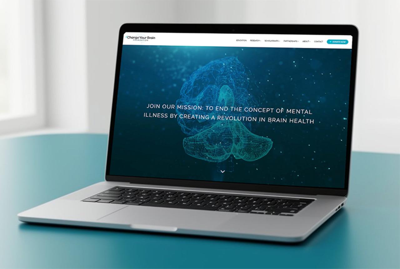
Over a multi-year engagement, I was brought in to unify a 35-year-old organization that had grown organically across multiple divisions, each with its own identity, tone, and operating culture. The challenge wasn’t redesign—it was alignment.

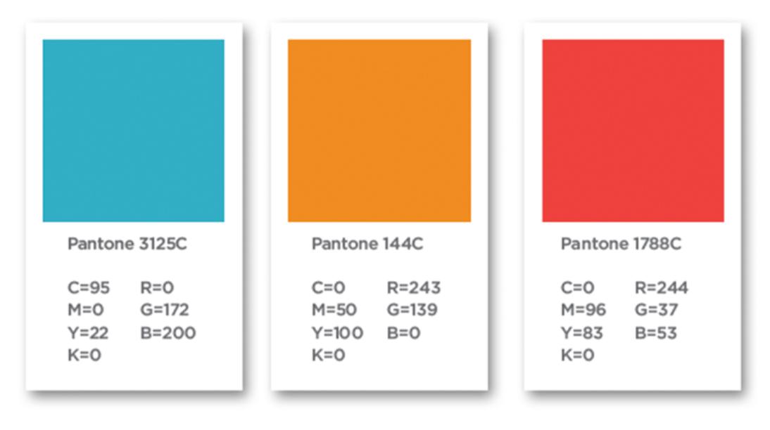
I led the creation of a shared brand architecture that allowed distinct business units to maintain autonomy while presenting a cohesive, credible system to patients, partners, and clinicians. This included developing a scalable logo system, visual language, and usage standards that could function across clinics, education, products, nonprofit initiatives, and live environments.

The result was a unified brand ecosystem—one that improved clarity, reduced fragmentation, and enabled teams to work together under a common visual and strategic framework.

A Brand Identity Built for Trust and Accessibility

Centrum Health required a brand identity that could establish trust quickly, scale across diverse patient populations, and remain distinct within a highly competitive healthcare landscape.

I led the development of a clear, accessible identity system designed to feel modern, human, and credible—balancing clinical confidence with warmth and approachability. The goal was not decoration, but clarity: a visual system that patients could recognize, understand, and feel comfortable engaging with across digital and physical environments.

The resulting identity provided a flexible foundation for clinics, communications, and future growth—built to function consistently across language, culture, and care settings.

Core color system designed for clarity, accessibility, and calm

A Mark Built on Simplicity and Precision

Capstan’s identity was designed to reflect the system behind the technology—clean, intentional, and exact. The dot structure represents individual nozzle control and GPS accuracy, while the simplified form reinforces trust, reliability, and repeatable performance in the field.
Scroll to Top