Amen Clinics Brain MD Supplements A System Built to Scale

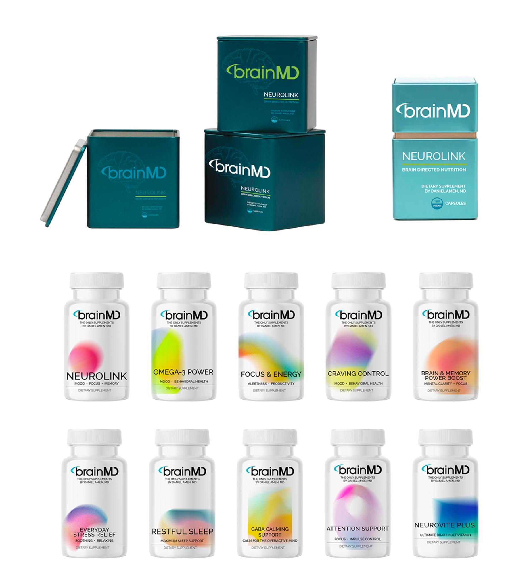
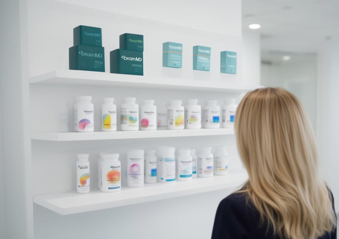
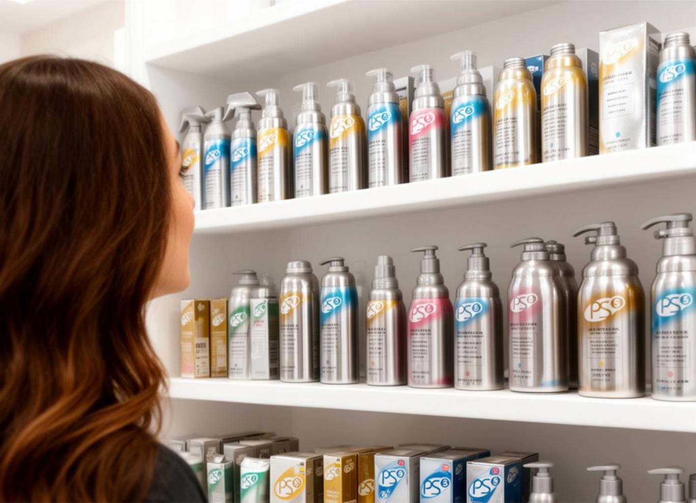
While at Amen Clinics, I took on the challenge of rethinking BrainMD’s packaging as the product line expanded. Aging designs, inconsistent color usage, and visual overlap were creating confusion on shelf and online.

The solution was a new, flexible packaging system — one that clarified hierarchy, reduced color collision, and allowed the brand to grow without losing recognition or trust. Each product became easier to identify, easier to shop, and more cohesive as a family.

The result was a cleaner, more confident brand presence built for scale — one that supported both new product launches and long-term growth without constant redesign.

PS Home Cleaning Products Hospital-Grade. Home-Ready.

PS was a family of home cleaning products built on the same proven formulas hospitals use under the Metrex brand — reimagined for the home with added scents and elevated design. Months of focused design work and consumer testing shaped every detail, from form to finish.

At the client’s request, we developed spun aluminum packaging — surprisingly cost-effective and significantly more environmentally friendly, using largely recycled material and avoiding new mining altogether. The result was a product that jumped off the shelf and felt worthy of being left out on display, not hidden under a sink.

The experience was rare and formative — a deep dive into design, materials, sustainability, and perception — and one I won’t forget.

Seabourn Cruises A House Wine, Reimagined

Seabourn Cruises set out to create a proprietary “house” wine with branding that felt refined, understated, and worthy of the Seabourn name. The brief called for an upscale design that aligned seamlessly with the brand’s luxury experience onboard.

The result was a label that fit naturally within the Seabourn world, reinforcing the brand’s premium positioning without competing for attention.

Hoover Windtunnel Vacuums

Designed to Speak to Everyone

Hoover asked for a fresh, brighter look for their best-selling WindTunnel vacuum line. Research revealed a clear split: primary buyers (women) responded emotionally to faces and children on packaging, while men focused more on features and performance.

The final designs balanced both — pairing human warmth with clear product benefits. It was a challenging brief, but the result delivered packaging that connected emotionally, communicated functionally, and supported one of Hoover’s strongest product lines.

Scroll to Top