Florida Keys and Key West

One of the best accounts I ever had the pleasure to work on was the Florida Keys. The client was simply smart enough to trust the people working for them and we created great work for them. During my 10 years of hard work at Tinsley Advertisng I noticed this account had a lack of consistency across the entire campaign. The first concept you see below became the standard while Jim Johnson, account director at the time, came to realize consistency was important.

Every brochure, advertorial, co-op, print ad, and poster was required to take this look. I may have created a bit of a nightmare as each piece required photoshoots and heavy retouching to create the authentic result. This wasn’t Disney World and the campaigns always reflected it.

Posters

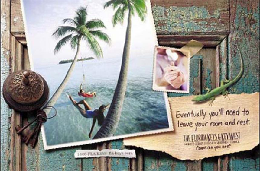
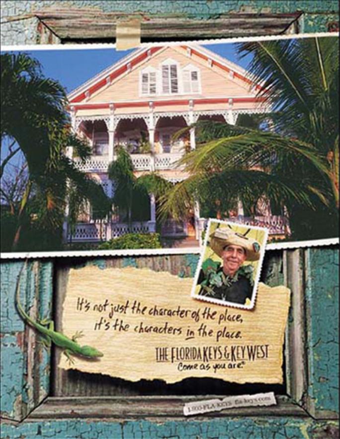
The Florida Keys was one of the most rewarding accounts I’ve worked on, built on a foundation of trust and creative consistency. A single visual standard became the backbone of every brochure, print ad, poster, and co-op—creating a cohesive, authentic voice across the brand.

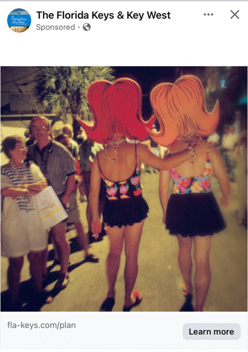
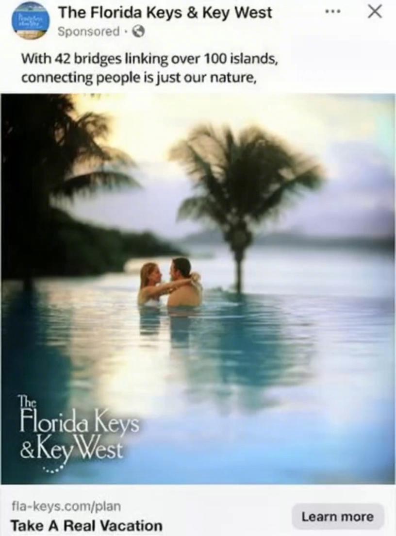
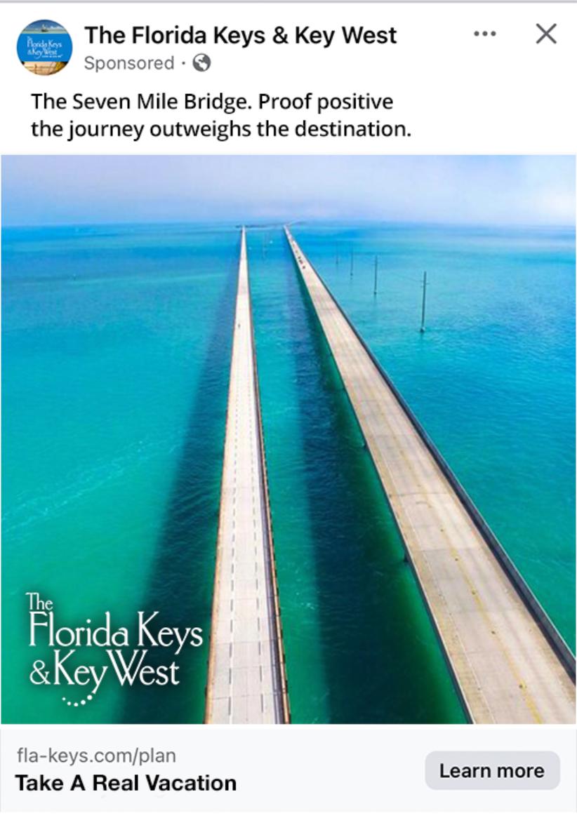
That same discipline carried into social media, where smart, fact-driven storytelling replaced hype. Real details—the Keys’ 2,800 miles of protected marine sanctuary and the 42 bridges connecting more than 100 islands—gave the content credibility and momentum. The result was work that felt honest, distinctive, and unmistakably the Florida Keys.

Scroll to Top